2nd October - Lesson One
In our first lesson of critical studies we just just given an over view of what this years course would entail.
So in this year critical studies we will given a background to contemporary art and basically what art is on a whole and also especially for us as photographers, it will give us an idea of how art has formed photography over the years.
Another thing that we will learn over the course of this module is how art had helped developed a personal vision by making us "informed" (knowing about art as a whole).
Even though i'm not doing a fine art course or things like that, learning about art in this critical studies module will help me to gain confidence and substance within my own work as a photographer.
Another thing as to what we will learn and have to remember is that while looking at these painting, the "IDEAS" are more important to know than the facts like names and dates.
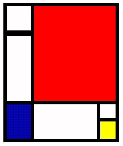
The first artist that we looked at in the lesson was Pete Mondrian - Pieter Cornelis "Piet" Mondriaan, after 1906 Mondrian March 7, 1872 – February 1, 1944), was a Dutch Painter.
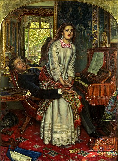
In todays lesson we looked at and compared between "Post Modernist Art" and "Modernist Art". To do this we looked at one Post Modernist painting and one Modernist Painting. The Post Modernist painting that we looked at was done in 1833 and was done by William Hunt, and it was called "The Awakening Conscience". Here is the image below-


Another thing that we will learn over the course of this module is how art had helped developed a personal vision by making us "informed" (knowing about art as a whole).
Even though i'm not doing a fine art course or things like that, learning about art in this critical studies module will help me to gain confidence and substance within my own work as a photographer.
Another thing as to what we will learn and have to remember is that while looking at these painting, the "IDEAS" are more important to know than the facts like names and dates.
The first artist that we looked at in the lesson was Pete Mondrian - Pieter Cornelis "Piet" Mondriaan, after 1906 Mondrian March 7, 1872 – February 1, 1944), was a Dutch Painter.
He was an important contributor to the De Stijl art movement and group, which was founded by Theo Van Doesburg. He evolved a non- representational form which he termed Neo - Plasticism. This consisted of white ground, upon which was painted a grid of vertical and horizontal black lines and the three primary colours.
From looking at Mondrian's images we can see how fine art has influenced everything over the years, things like - chairs, building, fashion, and album covers.Here below are the images that show Mondrian's images and how it has effected things over time.


9th October - Lesson TwoFrom looking at Mondrian's images we can see how fine art has influenced everything over the years, things like - chairs, building, fashion, and album covers.Here below are the images that show Mondrian's images and how it has effected things over time.


Next we moved on to look at an artist called Yoyoi Kusama - we looked at her work becuase alot of her work all stems from Fine Art, here is some iamges that are examples of fine art -


"Fine Art is the Core of Visual Culture".
The next artist that we looked at was Masaccio - Trinty Fresco - 1427-

With this image we looked at 2 different versions, this was to see how the colour can be distorted in reproduction of images.
Then we moved on to look at Jackson Pollock - 1950 - and talked how about how the size of the image matters to the viewer, we can see that size matters when we compared Jackson to Dali. Jacksons painting were hugh and Dali's were very small, you had to be very up close to it, to really see what was happening in the image. here below are the images, the first is Jackson, the second is Dali-
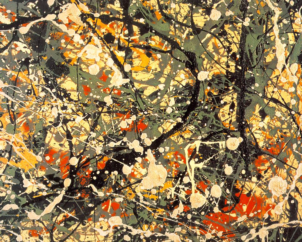

From these two images we can learn and see that the whole context of a painting is important.
Next we moved on to talk about what we were actually going to be looking at through the module this year and what parts it was going to be broken down in.
First is.......
Early Postmodernism -1950's - 60's
- Andy Warhol - 1962
- Richard Hamitton - 1956
- Rauschenbery - 1956
- Smithson - 1969-70
- Dubffet - 1955
- Tapies - 1969
They all created work that wasn't pleasing to the eye - they used all sorts of natural materials.
Mid-Postmodernism - 1968 - 80's
This was a period of rebellion - Martin Luther King, Vietnam War and Feminism.
- Velazques
- Sylvia Sleigh
- Judy Chicago
- Betty Saar
In Mid-Postmodernism art became political, it tried to get people to question things. And lastly is.....
Late-Postmodernism - 1970's - 80's and 90's
Media driven - "IMAGE" became important, art that has shock value came into play.
- Koons -1988
- Martin Creed - 1994
- Damien Hirst -1994
- Jenny Saville - 1992
- Therese Oulton
- Andy Goldsworthy - 1955
- James Turrell - 1995
In todays lesson we looked at and compared between "Post Modernist Art" and "Modernist Art". To do this we looked at one Post Modernist painting and one Modernist Painting. The Post Modernist painting that we looked at was done in 1833 and was done by William Hunt, and it was called "The Awakening Conscience". Here is the image below-
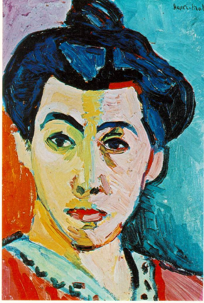
and the second painting that we looked at to compare the 2 was done in 1905 by Henri Matisse and it is called Portrait Madame Matisse/ or The Green Line, and here is the image below-

When looking at these image we asked in small groups to compare and contrast the 2 images, so here are things my group came up with:-
Image One -
- Has more context within the background - more detail.
- For richer people
- Lost of information given with the image - we start to make a story from the image, we do this because there are people within it.
- Its a narrative painting.
- Recognisable forms
- The cat in the image has a bird and is toying with it- we can relate to that by the man and woman.
- Has a moral purpose in the image
Image Two-
- uses dominant brush strokes
- limited colour pallet - contrasting colours
- colours are not blended - cartoon like
- looks powerful - she looks masculine
- the painting is about colour not about a telling a story - not a narrative image
- Its an impression image
- its a flat image, no depth, its giving no information about her e.g. what is she wearing?, where is she?
- Subjective use of colours
So the purpose of the first painting it to give us a message, but the second painting has no purpose, no message, it is just a atheistic image.
Next we moved on to look at Modernist work - for this work we looked at the work of Peit Mondrian (1921) and compared him and his work to another Modernist painter called Henri Matisse.
This first image is by Mondrian -


Analytical Cubism is the first developmental phase of Cubism. The work is difficult to read (interpret) and is willfully ambiguous. http://instruct.westvalley.edu/grisham/1d_analycub.html
This lead us onto looking at Jan Gris, Violin and playing cards - 1913, this was known as Synthetic Cubism - this was a more colourful recognisable form of different king of materials.
Cubists were the first to use collage, text and earth materials. Cubism also effected architecture too. Cubism later fed into minimalism.

23rd October - Lesson 4
In todays lecture we moved on to look at and research about Late Modernism.
To start off we listed the different values of Modernists. They are -
Next we moved on to look at Modernist work - for this work we looked at the work of Peit Mondrian (1921) and compared him and his work to another Modernist painter called Henri Matisse.
This first image is by Mondrian -

and this second image is by Matisse -
we then looked at these 2 images and compared to two to each other, these are the different points we came up with :-
- Mondrian is introducing simplicity so makes Matisse's work look far more detailed.
- Mondrian is only made up of lines, shapes and primary colours, whereas Matisse's is of people and he uses a variety of colours, not just priamry.
- Mondrian's work is not a narrative its a composition, its also abstract, limited vocabulary.
Abstract means to "take from its context."
Mondrain didn't always create abstract image though, he also created landscape images, for example "The Red Tree", here is the image below -

Even though this image is different to the abstract one i showed above, we can still see that this image is quite simple, and from the painting that came after this one we can see how his work lead to very abstract stuff, here is the worked that followed -


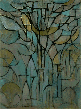
From these images we can still see the basic form of the tree, but we can also see how his work changed and become more abstract by just starting to use simple lines and basic minimal colours.
A good quote that i think goes along well with this kind of painting, or any painting in that fact was said by Maurice Denis in 1890 and it said - "Remember that a picture, before being a horse, a nude or an anecdote, is essentially a flat surface covered with colours."
Within Modernism art there are some characteristics, these characteristics are :-
- No Narratives - Picture is not vehicle for the message
- Auntonomous - Stands alone, independent of the real world
- Rejection of detail - The essential value of something
- Artisit becomes very important - The artist uses colour for expression, freedom to express their views on the world
- The moderenist artists goals and views was to move art forward in to the 20th century - This brought in lost of experiments
Next we moved on to look at J.A.M Whistler - James Abbott McNeill Whistler (July 11, 1834 – July 17, 1903) was an American-born, British-based artist. Averse to sentimentality and moral allusion in painting, he was a leading proponent of the credo, "art for art's sake". His famous signature for his paintings was in the shape of a stylized butterfly possessing a long stinger for a tail.The symbol was apt, for it combined both aspects of his personality—his art was characterized by a subtle delicacy, while his public persona was combative. Finding a parallel between painting and music, Whistler entitled many of his paintings "arrangements", "harmonies", and "nocturnes", emphasizing the primacy of tonal harmony. His most famous painting is Whistler Mother (1871), the revered and oft parodied portrait of motherhood. Whistler influenced the art world and the broader culture of his time with his artistic theories and his friendships with leading artists and writers.
The image above is a very realistic image of his mother, his aim was to bring Harmony of colour through his paintings.
Afternoon Seminar
In this afternoon seminar we started it by first watching a sort video that was on the Guardian Website called "The Rain Room". Here below is a screen shot of the website and also a link to the website page -

From watching this video we learnt that Artists and Designer are very different - the difference that was said in the video was that Artists have an agenda and Designers have a purpose.
After we were each told to pick an image from the table and then tell the class why we had picked that image, the image i chose was by Sir Terry Frost, called "Red, Black and White and was painted in 1955. here is that painting -

I picked this image because i liked the simplicity of it, it is a very abstract image, it doesn't tell a story. I also picked this image because i just liked it, there were no other real reasons as to why.
After we spoke about the images we picked, it led nicely on to passage of writing we read in the "Art of Theory - 1900-200" book by clive Bell and how he was trying to put across this theory of "complete theory of visual art". He said "The starting point for all systems of aesthetics must be the personal experience of a peculiar emotion". He also said that only one answer to art seem possible and that was - Significant Form-, He said " In each, lines and colours combined in a particular way, certain forms and relations of forms, stir our aesthetic emotions. These relations and combinations of lines and colours, these aesthetically moving forms, i call "significant form" and "significant form" is the one quality common to all works of visual art.".
16th October - Lesson Three
In todays lesson we moved on to talk about "Modernity and Modernism". First we talked about different well known structures, first the Eiffel Tower.
The Eiffel Tower was built in 1889, was made out of iron and was 1060 feet high. The Eiffel Tower was built for a world famous exhibition, it was a international exhibition to show new modern things. it symbolised the start of new age.

Another structure we looked at was Hyde Park Crystal Palace in 1854. The Crystal Palace was made out of glass and iron. A modern day building that is similar now is the Trafford Centre.


Gustav Eiffel designed the Eiffel Tower. They were proclaiming Paris as the modern city. It had a mass audience because you could see it from all over Paris, unlike art, which you could only see if you actually went to see it in an exhibition or something like that.
Another thing that was new when the Eiffel was built was that from the arial view from the top of the tower, people had a new way of viewing the world - the world started to look flat - patterns, this went on the influence art.

An example of this is a painting called "In the Mountains" by Andre Derain. His painting was influenced by the patterns of the Eiffel Tower and we can see this because of the Flat Perspective, the Block Colours, and the Flat View.

The industry changed - new inventions started to come about e.g. Light Bulbs, this effected art because you could now work for a longer amount of time and also artists started to see colour in different ways too.
How will these new inventions make implications for art???
- Work could be done when it couldn't before.
- More materials and ways to create art came about.
Photography became composition for art because it was easy to capture something - you didn't have to spend hours and hours doing hard detailed paintings.
Photography became an experiment for artists, it was a change from just painting the norm.
Also photography had a negative and positive effect on art.
Modern life started to effect art. "Modern art had to take in a new way of seeing".
The first artists we looked at was Fernand Leger. Fernand Leger was a French painter,sculptor, and filmmaker. In his early works he created a personal form of Cubism which he gradually modified into a more figurative, populist style. His boldly simplified treatment of modern subject matter has caused him to be regarded as a forerunner of Pop art.
we looked at one of his painting called "The Playing Cards - 1917".

The figures in the pictures are Machine like and fragmented - chopped up and then put back together. The soldiers playing cards are a leger depiction.
Another painting that we looked at of Leger's work was "Three Women - 1921.

Again this painting is very similar to the first one we looked at because again it is very fragmented, very flat, it has no perspective and again the people in the picture are very machine like, like the one above.
The next artist we looked at was Umberto Boccioni. Umberto Boccioni was an Italian painter and sculptor. Like other Futurists, his work centered on the portrayal of movement (dynamism), speed, and technology. the painting of his that we looked at is called "The City Rises" - 1910.

we then talked about this image and picked the main features out of it, to try and explain the painting - these are points we came up with about the painting -
- Construction
- Horse dragging heavy materials to move the work along
- Dramatic
- Movement long brush strokes - no blended colours
- Full image
People started to look to photography to help create movement within their images. An artist that we looked at for an example of this was Eadweard Muybride. Eadweard Muybride was an English photographer important for his pioneering work in photographic studies of motion and in motion - picture projection.
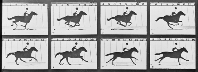

People were amazed by this work because they were able to capture the idea of movement, this new kind of work moved art along.
Another artist that also tried to capture movement within his images was Giacome Bella. He created the image "Dynamism of a dog on a leash" 1912.

This was a futurist idea - it was to capture movement in paintings.
Next we looked at Boccioni again and looked at the painting called "Dynamism of a cyclist" 1913.
This image made more of a cubist look - he took it apart and put it back together again.

The next artist that we looked at, that produced similar work to Boccioni, in the way that their work looks like it has been taken apart and then put back together again. This next artist is George Braque.
Braque was a major 20th-century French painter and sculptor who, along with Pablo Picasso, developed the art style known as Cubism. Braque painted the picture called "Violin and Candle stick".

This image was then later developed by an artist called Juan Gris. Gris was a Spanish painter and sculptor who lived and worked in France most of his life. His works, which are closely connected to the emergence of an innovative artistic genre - Cubism - are among the movement's most distinctive.
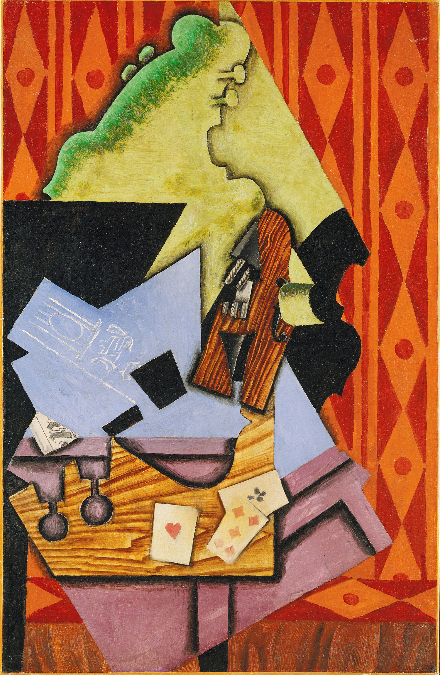
This painting of the Violin and Playing Cards was painted in 1913.
After looking at these different images, we then on to watch a sort clip from a film called "Metropolis" which was directed by Fritz Lang.
This a clip from the film that we watched in the lecture, we watched this certain clip because we were looking at how the paintings and at the time within Cubism, and how the painting were looking "machine like"were then effecting different things like films. Within this film we see that man has become machine like, in the way they move, it also shows De - Humanisation, class Distinction and workers underground. Its shows a certain view of what modernity could be like in the further.
After watching this clip, we then went to look at artist that had a negative view on Modernity.
The frist artist is Jacob Epstein. Epstein was a sculptor who helped pioneer modern sculptor. He often produced controversial works which challenged taboos on what was appropriate subject matter for public artworks.
He produced work where he showed "man" and "Machine" together as one.

Next we looked at Kandinsky. Kandinsky was an influential Russian Painter and art theorist. He is credited with painting the first purely abstract works.
Kandinsky taught the basic design class for beginners and the course on advanced theory at the Bauhaus; he also conducted painting classes and a workshop in which he augmented his colour theory with new elements of form psychology. The development of his works on forms study, particularly on points and line forms, led to the publication of his second theoretical book (Point and Line to Plane) in 1926. Geometrical elements took on increasing importance in both his teaching and painting—particularly the circle, half-circle, the angle, straight lines and curves. This period was intensely productive. This freedom is characterised in his works by the treatment of planes rich in colours and gradations—as in Yellow – red – blue (1925), where Kandinsky illustrates his distance from the constructivism and suprematism movements influential at the time.

Kandinsky said that " The soulless content in modern life - he felt like something was missing in modern life."
.jpg)
This painting above is another of Kandinsky paintings called "All Saints". With is image he painted on the frame - he continued the painting, he did this so the painting isn't limited to the frame, it carries on and goes out into the world.
Afternoon Seminar
Within todays afternoon seminar we talked about cubism and how it had a great impact on modernism.
The first artist that we looked at was Georges Braque, he was a major 20th-century French painter and sculptor who, along with Pablo Picasso, developed the art style known as Cubism.
Pablo Picasso was a Spanish painter,sculptor, printmaker, ceramicist, and stage designer who spent most of his adult life in France. As one of the greatest and most influential artists of the 20th century, he is widely known for co-founding the Cubist movement, the invention of constructed sculpture, the co-invention of collage, and for the wide variety of styles that he helped develop and explore.
Here below is some of the work they created -

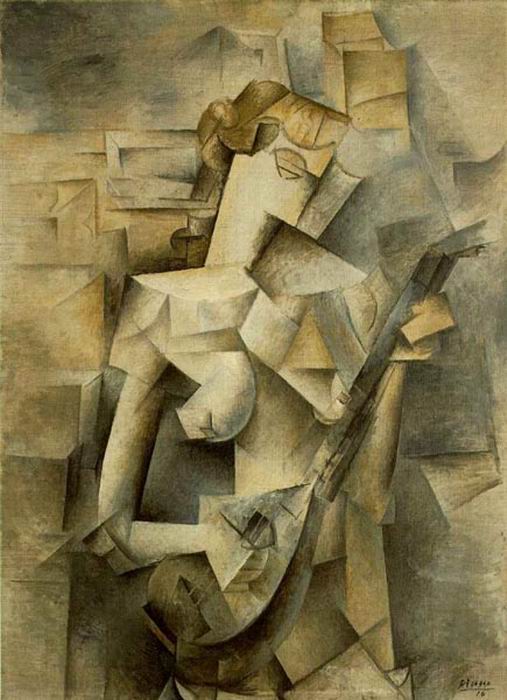
They both wanted to make paintings that used both the eyes and the brian. Cubism is getting away from looking at things in the normal way, this is to give it another view point, flattening things to the viewer. This faze was called "Analytical Cubism". Cubism was the most radical and influential “ism” in 20th Century art. It provided the catalyst to 20th Century art that the I5th Century Italian Renaissance provided to the I6th Century Italian High Renaissance. Cubism was the joint invention of Picasso and Braque. Dedicated “ to the simplification of painting”, they (attempted) to exclude all but the formal elements of art: line, shape, and color (formalism). Inspired by Cezanne, the Cubists developed a new way of depicting space which involved multiple and mixed perspectives. Because they believed that there “was no one fixed view of nature”, the figure and ground were given equal importance and broken into geometric components or facets. Cubism lead to abstraction and necessitated a new way of looking at art. The first phase, Analytical Cubism was more intellectual than its more decorative second phase, Synthetic Cubism.
This lead us onto looking at Jan Gris, Violin and playing cards - 1913, this was known as Synthetic Cubism - this was a more colourful recognisable form of different king of materials.
Cubists were the first to use collage, text and earth materials. Cubism also effected architecture too. Cubism later fed into minimalism.

23rd October - Lesson 4
In todays lecture we moved on to look at and research about Late Modernism.
To start off we listed the different values of Modernists. They are -
- Essence - universal rather than individual
- Fundamentals - reduction, condensation of ideas and forms
- Truth not illusion
- Aesthetic quality - equilibrium, harmony
- Abstraction
- Authorship - creators expression
- Transcendence - takes the viewer beyond everyday
Within late modernism, a lot of the European artists moved over to America so America than became the centre of the late paintings.
The first artist we looked at was Barnett Newman. Barnett Newman was an American artist. He is seen as one of the major figures in abstract expressionism and one of the foremost of the colour field painters. he paintings were very basic, plain and simple paintings, also a common factor within his paintings were vertical lines.
His images were also very large painting, this was to get the full effect of the meaning behind them, they are trying to show and create a aesthetic and emotion feel.. These images related to late modernist values, that i listed just above.
Barnett Newman's paintings were "self evidence", all you had to do was look at them and let the paintings work on you.


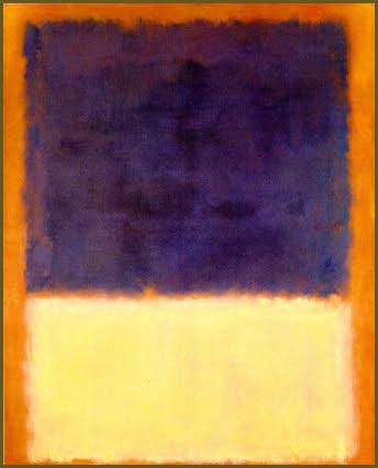
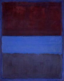
The next artist that we went to look at was Mark Rothko. Mark Rothko was a Russian - American painter. He is classified as an abstract expressionist, although he himself rejected this label, and even resisted classification as an "abstract painter".
A quote that we read that Rothko said was "However you paint a large picture, you are in it - its something you command".
Rothko's work was more colourful and was similar to Newman's work because its all about the colour and experience. Also another factor to Rothko's work was that his painting never had any proper titles, they were all just named after the colours that he used. His images were also meant to be thought about - Contemplated.


And lastly the last artist that we looked at today was Jackson Pollack. Jackson Pollack was an influential American painter and a major figure in the abstract expressionist movement. He was well known for his uniquely defined style of drip painting.
6th November - Lesson 5.
In todays lecture we moved on to look at "Consumerist Culture". Consumerism is a social and economic order that encourages the purchase of goods and services in ever-greater amounts. The term is often associated with criticisms of consumption starting with Thorstein veblen. Veblen's subject of examination, the newly emergent middle class arising at the turn of the twentieth century, comes to full fruition by the end of the twentieth century through the process of globalisation. In this sense, consumerism is usually considered a part of media culture.
To look at consumerist in a more artistic way we looked at the Bauhaus, the Bauhaus created and made things that were simple things, and that had "modernist ideas", these were things like interior, teapots,chairs and lamps.


They objects they made very simple, very universal, they were striped back and everything had a functionality that was important, they had to be object that everybody could use.
An example of this is Marcle Breuer, who created Bauhaus Interior in 1926. He created a very minimal yet functional style of interior, this was because the aim of the Bauhaus was to provide a "type form". The only reason to change "type form" was if technology changed and something new and better came long.
Later on the USA had a high consumption stage, people had everything, so they didn't have to stimulate the urge to buy anymore. So design became more about the individual no the society as a whole. this then started up a period of intense design, they needed new ideas all the time to make peole buy things, for example the car.

13th November - Lesson 6
In todays lecture we looked at the Early Postmodernism - A new model of culture.
This lecture I have made as one of my 300 word sections -


20th November - Lesson 7
A quote that we read that Rothko said was "However you paint a large picture, you are in it - its something you command".
Rothko's work was more colourful and was similar to Newman's work because its all about the colour and experience. Also another factor to Rothko's work was that his painting never had any proper titles, they were all just named after the colours that he used. His images were also meant to be thought about - Contemplated.
Another artist that we looked at was Adolph Gottlieb. Adolph Gottlieb was an American abstract expressionist painter, sculptor and graphic artist. Within his work the shapes were a very important factor, these shapes were very large and simple. Gottlieb used very plain colours but the colours that he used within his images always contrasted with each other, so led the viewer to create their own meaning.


During his lifetime, Pollock enjoyed considerable fame and notoriety. He was regarded as a mostly reclusive artist.
Pollack painted very large images, with very different looks compared to the other artists that we have looked at, these images of Pollack's had no structure and no focal point, he just threw paint anywhere and everywhere.They also had lots of energy within them and were very dynamic to view. His paintings were called "action painting", this is because he moved around the paintings in a way that no other artist did before.


Afternoon Seminar
Within today seminar we started to talk about and look at Still Life and some of the artist that produced this kind of work.
Still Life is a work of art depicting mostly inanimate subject matter, typically commonplace objects which may be either natural (food, flowers, plants, rocks, or shells) or man-made (drinking glasses, books, vases, jewelery, coins, pipes, and so on). With origins in the Middle Ages and Ancient Greek/Roman art, still life paintings give the artist more leeway in the arrangement of design elements within a composition than do paintings of other types of subjects such as landscape or portraiture. Still life paintings, particularly before 1700, often contained religious and allegorical symbolism relating to the objects depicted. Some modern still life breaks the two-dimensional barrier and employs three-dimensional mixed media, and uses found objects, photography, computer graphics, as well as video and sound.
The first artist that we looked at was Henri Fantin-Latour, He was a French painter and lithographer best known for his flower paintings and group portraits.


So what is the contemporary version of this now?........The answer is Photography. The update version of Fantin-Latour work now is Ori Gersht in 2007. Ori Gersht is an Israeli fine art photographer. He is a professor of photography at the University for the Creative arts in Rochester, Kent, England.


6th November - Lesson 5.
In todays lecture we moved on to look at "Consumerist Culture". Consumerism is a social and economic order that encourages the purchase of goods and services in ever-greater amounts. The term is often associated with criticisms of consumption starting with Thorstein veblen. Veblen's subject of examination, the newly emergent middle class arising at the turn of the twentieth century, comes to full fruition by the end of the twentieth century through the process of globalisation. In this sense, consumerism is usually considered a part of media culture.
To look at consumerist in a more artistic way we looked at the Bauhaus, the Bauhaus created and made things that were simple things, and that had "modernist ideas", these were things like interior, teapots,chairs and lamps.


They objects they made very simple, very universal, they were striped back and everything had a functionality that was important, they had to be object that everybody could use.
An example of this is Marcle Breuer, who created Bauhaus Interior in 1926. He created a very minimal yet functional style of interior, this was because the aim of the Bauhaus was to provide a "type form". The only reason to change "type form" was if technology changed and something new and better came long.
Later on the USA had a high consumption stage, people had everything, so they didn't have to stimulate the urge to buy anymore. So design became more about the individual no the society as a whole. this then started up a period of intense design, they needed new ideas all the time to make peole buy things, for example the car.


Consumerists society shifted the balance from objects made for a function to objects having a purpose. Also modernist design aimed to unify people, design was made to make a difference between people, so the consumerist society was the basis of the post modernism.
Lifestlye too became important and design became a language telling the world about your life.13th November - Lesson 6
In todays lecture we looked at the Early Postmodernism - A new model of culture.
This lecture I have made as one of my 300 word sections -
Early Postmodernism: A new model of
culture – The Early Postmodernism period of
time was all about the Mass Media and Plurality and the two artist that
represent this are Andy Warhol and Richard Hamilton. Within this period there
was the introduction to an independent group of London based artists, this
group consisted of artists, sculptors, and photographers. They shared ideas
that were quite radical at the time and that were coming over from the U.S.A.
At this time of Post Modernism there was an art critic called
Alloway, he was an art critic that was against the idea of uniqueness. He liked
idea and was open to change, this is why he thought the Mass Media culture was
valid, because of the changing world.
One of the key points to the Mass Media is “Change”, the mass
media wasn’t made to last, it was made for change, to be always current and up
to date.
Richard William Hamilton was a British painter and collage artist.
His 1956 collage, Just what is it that
makes today’s homes so different so appealing?, produced for the This is tomorrow exhibition of the
Independent Group in London, is considered by critics and historians to be one
of the early works of pop art. Hamilton views art as a visual research, in his
work he shows how he got his ideas for his paintings, he wants them to be clear
to the audience. The meaning to his work was important, this factor moved art
along because artist started to show the meaning behind their images.
This now leads
on to Andy Warhol, his work was very similar, although Warhol’s work was more
about representing something – repetition. Within his work, he wasn’t
interested in the details, he was just interested in showing the object, the
product.Later on in Warhol’s work he stared to produce “Mass Production” work,
painting one object, but repeating it over and over again, an example of this
was the Coca Cola bottle.
Hamilton and
Warhol were similar with mass media production but different because Hamilton
had an agenda, Warhol didn’t.


In todays lecture we looked at 2 different artist, they were Jean Dubuffet and Antoni Tapies. These were the 2 artist that tried to keep hold of Modernism.
27th November - Lesson 8
In todays lecture we covered the work of Figurative Art in the 1960's. this lecture is one of the sections I have made into one of the 300 words.


27th November - Lesson 8
In todays lecture we covered the work of Figurative Art in the 1960's. this lecture is one of the sections I have made into one of the 300 words.
Figurative
Art in the 1960’s - Figurative art is often defined in contrast to abstract
art. Since the arrival of abstract art the term figurative has been used to
refer to any form of modern art that retains strong references to the real
world. Throughout the 1960’s the four main artists that we looked at were,
David Hockney, Phillip Guston, Francis Bacon, and Chuck Close. The first artist
we looked at was David Hockney, Hockney was an Eclectic Artist, he liked and
enjoyed a mixture of styles and techniques within his artwork. Hockney was a
mixer between traditional style and Op art style, an example of this was his
painting he did called “The First Marriage”. This painting was showing an
actually marriage between people but also showed a marriage of the different
styles. Another artist that we looked at was Chuck Close, he was an American
artist that worked closely with the human figure, but in a very way to Francis
Bacon, who created very raw human emotion, and sinister paintings. He was
interested in the human face for translating information and visual data, which
lead to the reason why he liked and enjoyed and had an interest in photography.
Close’s work was very Hyper Real, and huge Paintings.
Figurative
art started to show very different cultures in the 1960’s, this was Pluralism
and Diversity, it showed to people that these different types of cultures can
co-exist with each other, and that there was no longer a single way of doing
things and producing art and that now all these different styles were equal to
each other. Also because of this figurative art there came a new pop art, which
now has a different aim to the pop art that originated.

4th December - Lesson 9
In this weeks lecture we looked at the work that was being produced in the 1960, we looked Sculpture within the 1960's. Again this is one of the lecture that i will using as one of my 300 words.
Sculptor in the 1960’s – The traditional notion of what sculpture is,
is, 3D, usually made out of Stone, Wood, or Bronze and they are usually seen in
a large public space e.g. a museum. Throughout the 1960’s there were seven main
artists that produced artwork in the form of sculptures. These artists were
Anthony Caro, Phillip King, Tim Scott, William Tucker, Donald Judd, Carl Andre
and Robert Morris. First was Anthony Caro. Caro’s early work was very
traditional and very figurative, for example his work showed off a lot of the
human form, but then later on in his career he took a more abstract approach to
his art work and started to create large abstract sculptures brightly
painted and standing directly on the ground so that they engage the spectator
on a one-to-one basis, this would then change the way of future developments
within sculpture. Anthony Caro and Phillip King’s work was highly influenced by
Pop Art, their work was not traditional. Whereas on the opposite side to this
work was Minimalism (all about the object as a whole) which was being created
by Donald Judd, he created work that was very straight forward, no drama and
repeated shapes, that were all in a row, unlike Pop Art. Judd wanted to work
for the truth of the art and wanted to look at the whole object, not the
different parts that made it up. Another sculptor who did similar work
(Minimalism) was Carl Andre, he created floor pieces, that were repeated units,
symmetrical and primary form. Andre also wanted his viewers just to see his
artwork as a whole, not separate parts. Sculpture in the 1960’s changed from
first being about a compositional relationship to a physical fact, the art went
from being either good or bad, to whether it was interesting or not.


22nd January - Lesson 10
No comments:
Post a Comment